
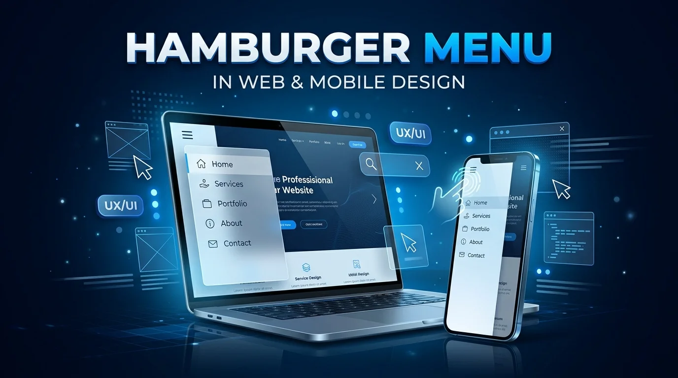
A hamburger menu is the familiar three-line icon that opens hidden website or app navigation. It saves valuable space, especially on smaller mobile screens. Yet hiding important links can also make navigation harder to discover.
The pattern works best when designers balance clean layouts with easy access to important destinations. Mobile websites often benefit because horizontal navigation cannot fit comfortably. Desktop websites usually have more room for visible links.
| Key point | What to know |
|---|---|
| Common symbol | Three stacked horizontal lines |
| Main purpose | Open and close hidden navigation |
| Common placement | Top-left or top-right corner |
| Best fit | Mobile and space-limited interfaces |
| Main benefit | Saves screen space |
| Main drawback | Hides navigation from immediate view |
| Accessibility need | Keyboard support and clear button states |
| Common alternatives | Visible navigation, tabs, bottom navigation |
Direct answer: A hamburger icon hides navigation behind a compact three-line button. Tapping or clicking it usually opens a drawer, panel, or menu. The pattern saves space, but important destinations can become less noticeable when every link is hidden.
Key Takeaways
* The three-line icon usually signals hidden navigation. * It is most useful when screen space is limited. * Visible navigation generally improves discoverability when space allows. * Important destinations should not automatically disappear behind the icon. * Accessible implementations need keyboard support and meaningful button states. * Mobile and desktop layouts may need different navigation strategies.
What Is a Hamburger Menu and How Does It Work?
The icon usually appears near one of the upper corners of an interface. A tap or click reveals navigation that was previously hidden. The navigation may slide from the side or appear over the page.
The control often changes after activation, sometimes becoming an X-shaped close icon. Users can then choose a destination or dismiss the panel. Good implementations make both actions clear without forcing users to guess.
The design is based on progressive disclosure, which reveals controls when they become relevant. This approach reduces visible interface clutter. It also adds an interaction before users can see hidden choices.
Why Is It Called a Hamburger Menu?
The nickname comes from the icon’s three stacked horizontal lines. People compared the upper and lower lines to buns and the center line to a patty. The name became common as the pattern spread across websites and mobile applications.
Designer Norm Cox created the three-line menu symbol for the Xerox Star interface in 1981. The symbol therefore predates modern smartphones and mobile websites. Its popularity grew much later as designers needed compact navigation for smaller screens.
Today, the symbol is widely recognized by many digital users. Nielsen Norman Group reported in 2025 that recognition has increased over the past decade. Recognition, however, does not remove every usability problem caused by hidden navigation.
Why Designers Use the Three-Line Navigation Icon
The biggest advantage is using limited screen space efficiently. A row containing several navigation links may fit poorly on a smartphone. A compact button leaves more room for content and important interface controls.
It can also simplify websites with complex navigation. Secondary destinations can remain available without competing visually with primary content. This approach works especially well when only a few actions require constant visibility.
The pattern also supports responsive layouts across multiple screen sizes. Designers can display full navigation on larger screens and collapse it on smaller ones. That approach avoids forcing the same navigation treatment onto every device.
Hamburger Menu Pros and Cons
The pattern solves a genuine layout problem, but every hidden navigation system creates a tradeoff. Designers gain space while reducing immediate visibility. The right choice depends on screen size, content priorities, and user behavior.
| Factor | Advantage | Possible drawback |
|---|---|---|
| Screen space | Frees room for content | Important links become hidden |
| Visual design | Reduces header clutter | Users see fewer available destinations |
| Mobile layouts | Fits narrow screens easily | Requires an extra tap |
| Large navigation | Holds many links | Long panels can feel overwhelming |
| Familiarity | Recognized by many users | An unlabeled icon can still be missed |
| Responsive design | Adapts well to small screens | May be unnecessary on desktop |
Research from Nielsen Norman Group illustrates the discoverability issue. Its testing found people interacted with visible navigation more often than hidden navigation. Hidden navigation also increased task time in the study.
Those findings do not mean every hidden menu is a bad design. Mobile layouts often face genuine space limits that require compromise. The better goal is deciding which destinations deserve permanent visibility.
When Should You Use a Hamburger Menu?
Use this pattern when displaying every navigation item would make a small screen crowded. It can be practical for responsive websites with many sections. It also works for secondary destinations users don’t need constantly.
A hybrid approach often provides a stronger balance. Keep the most valuable actions visible, and place secondary links inside the hidden panel. Users then see important choices without giving up the space-saving benefits.
Consider user expectations before choosing the pattern. A content-heavy mobile website may need more navigation choices than a focused application. Navigation should reflect the tasks visitors came to complete.
When Should You Avoid Hidden Navigation?
Avoid hiding primary desktop navigation simply because the design looks cleaner. Desktop screens normally provide enough space for important destinations. Visible links also help visitors understand the site’s structure immediately.
Hidden navigation can also hurt task-focused interfaces. A shopping website should think carefully before hiding categories, search, cart access, or account controls. Requiring extra actions can slow shoppers who already know where they want to go.
A short navigation system may not need collapsing on mobile either. Four clear destinations can sometimes remain visible without causing crowding. Testing the actual layout is better than automatically following a mobile convention.
Accessibility Best Practices
Build the trigger as a genuine button rather than a decorative image. Native buttons support common keyboard behaviors without requiring unnecessary custom code. The control also needs an accessible name that explains its purpose.
The button’s expanded state should update when the navigation opens or closes. W3C’s disclosure guidance recommends using aria-expanded to communicate that state. aria-controls can identify the content the button controls.
Keyboard users must be able to reach, open, use, and close the navigation, as with caret browsing in web browsers. Focus should remain predictable throughout that interaction. Closing a panel should not unexpectedly send users somewhere unrelated.
Avoid using ARIA’s complex menu role for ordinary website navigation without good reason. W3C notes that standard navigation links do not necessarily need that widget pattern. Simpler semantic navigation usually creates fewer accessibility problems.
Design Practices That Improve Mobile Navigation
Keep the menu trigger in a predictable part of the interface. Top corners remain common locations, so unusual placement needs strong justification. Consistency across pages also reduces learning effort.
Consider pairing the three-line icon with the word Menu when clarity matters. A text label removes ambiguity for visitors who do not recognize the symbol. It can also make the control easier to notice.
Organize the revealed links around user priorities rather than company structure, a core idea in intuitive digital experience design. Place high-demand destinations near the beginning of the list. Group related pages so visitors can scan choices quickly.
Use a generous touch target around the icon. The clickable area can be larger than the visible three lines. This makes the control easier to operate on smartphones.
Give users clear visual feedback when the panel opens. The icon might change state while the page background becomes visually secondary. Motion should remain subtle and should not delay access to navigation.
Hamburger Menu Alternatives
A three-line menu is only one way to handle navigation on smaller screens. Other patterns can surface important choices without permanently taking up much space. The best option depends on how many destinations users need most.
| Navigation pattern | Best suited for | Main strength |
|---|---|---|
| Visible top navigation | Desktop and simple sites | High discoverability |
| Bottom navigation | Mobile apps with a few core areas | Easy thumb access |
| Tab bar | Related sections or views | Keeps choices visible |
| Priority-plus navigation | Responsive websites | Shows important links first |
| Navigation drawer | Large mobile information structures | Holds many destinations |
| Search-led navigation | Large catalogs or databases | Fast direct access |
Bottom navigation can work well when an application has three to five primary areas. Users can see those destinations without opening another interface. Less important options can still live elsewhere.
Priority-plus navigation offers another useful compromise for responsive websites. Important links remain visible while lower-priority destinations collapse when space decreases. This approach preserves more information scent than hiding everything.
Choosing the Right Navigation Pattern
Start with the tasks people perform most often. Those tasks should determine which destinations remain visible. A clean header has little value if visitors cannot find important sections.
Next, test the design at realistic screen widths. Navigation that looks fine in a design file may wrap or crowd on actual devices. Longer labels can also create unexpected problems.
Finally, compare visible and hidden versions with real users when possible. Track task completion, navigation use, errors, and hesitation. Evidence from your own audience is more useful than following a design trend.
Common Mistakes to Avoid
Don’t hide every important action just to create a minimalist header. Visitors need enough visible information to understand where they can go. A sparse interface is not automatically easier.
Avoid filling the expanded panel with an unorganized wall of links. Group related destinations and establish a clear visual hierarchy. Long lists become easier to scan when categories have meaningful structure.
Do not forget the menu’s closed state during accessibility testing. Screen readers need accurate information about whether controlled content is available. Keyboard users also need predictable focus and dismissal behavior.
FAQ
What is a hamburger menu used for?
A hamburger menu is used to hide navigation behind a compact three-line control. It is especially common on responsive websites and narrow mobile screens. The pattern creates more space for page content while keeping additional destinations available.
Why does the hamburger icon have three lines?
The lines visually suggest a stacked list of menu choices. Norm Cox used the symbol on the Xerox Star interface in 1981. Its resemblance to two buns surrounding a patty later inspired the popular nickname.
Is the three-line icon bad for UX?
The icon itself isn’t inherently bad for user experience. The larger concern is hiding navigation that users may need to discover quickly. Visible or partly visible navigation can perform better when there’s enough screen space.
Should websites use hidden navigation on desktop?
Most desktop websites should expose important top-level destinations when space permits. Large screens reduce the need to hide navigation for layout reasons. Specialized interfaces may still have cases where a drawer makes sense.
Does an accessible menu need ARIA attributes?
The disclosure button should communicate whether controlled content is expanded or collapsed. aria-expanded is designed for that state, while aria-controls can identify the related content. Semantic buttons and navigation elements should still form the foundation.
The Bottom Line
The familiar three-line navigation pattern remains useful because mobile screens have limited space. Its strength is compactness, while its main weakness is reduced visibility. Strong designs use it selectively instead of treating it as the default everywhere.
Keep essential destinations visible whenever the layout allows. Use hidden navigation for secondary choices or genuine space constraints. Then test keyboard access, screen-reader behavior, touch targets, and real user performance.
For more practical technology explainers and interface guides, continue exploring TechPufy’s web development guides. Choose navigation that reduces effort rather than hiding options for visual simplicity. A menu succeeds when visitors can reach the right destination quickly.